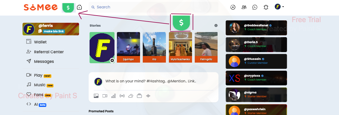
Just a UI suggestion. Wouldn't it make more sense and look better if the quick earnings tab (which I love) was up in the left corner instead of in the middle. This screenshot is from labtop, but I would suggest the same on the mobile version.
Just a UI suggestion. Wouldn't it make more sense and look better if the quick earnings tab (which I love) was up in the left corner instead of in the middle. This screenshot is from labtop, but I would suggest the same on the mobile version.